Show the "Report" chart by month or day

Hello,
When I go to the “Report” section, sometimes I see the chart like this (grouped by "DAY"s):

… And other times that chart be like this (grouped by "MONTH"s):

I know with the drop list that is located on top-lest I can get the report by project or billability, but how can I switch between the “Day” and “Month” groups?

Thanks

Hy Rahimzadeh

You can access the Date Range feature in the top right corner of your Clockify page to select a daily, weekly, monthly, or yearly time range. The bars will correspond to the selected date range.

Cheers!

But still, the grouping is selected automatically and cannot be adjusted, as mentioned here: More detailed summary report charts

For example, for a month, sometimes it may be much more convenient to group by weeks, not by days.

1 Like

Hi, Edin
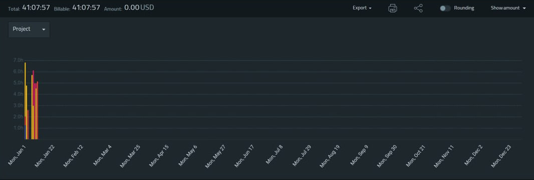
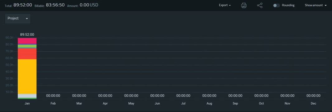
my issue is different with “Duration”. for example, if choose “this year”, sometimes the chart shows based on “days” data and sometimes in “Month” data.

Your suggestion is mine too, I voted for it.