I would love if two additional features were added:
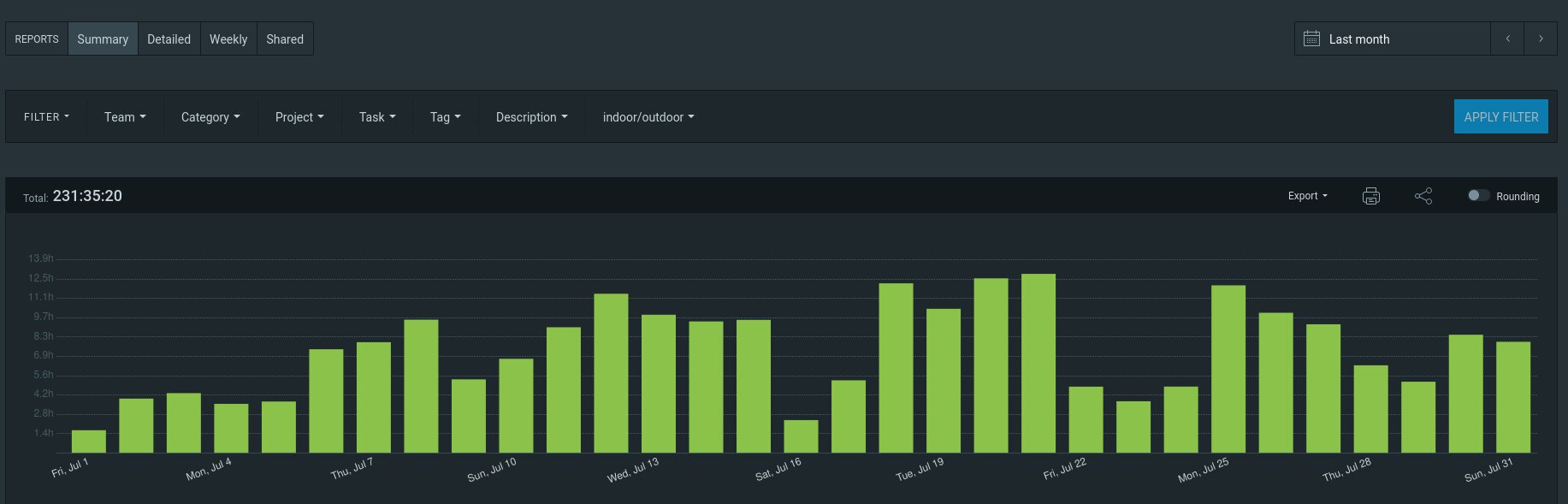
The ability to group tracked time per week/month/year, wrt. selected time interval. For example, in the case of the screenshot, the interval is “Last month”, and the entries can be grouped per week.
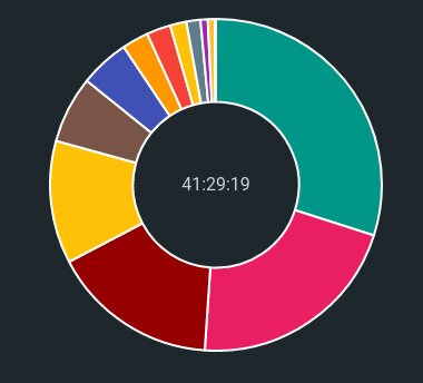
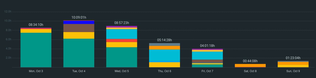
The columns (to my knowledge) only distinguish the criteria billable/non-billable. What about distinguishing the other aspects by color? Especially Project, like here:
Other things (Team, Category, Tag…) would be nice too, but have not assigned a concrete color etc., so it would be more complicated.
I noticed that the feature of distinguishing projects in charts is actually already implemented somehow, but not at ‘Reports’, but only at ‘Dashboard’:
So it would suffice to, at least, allow the same thing at ‘Reports’ as well.
‘Dashboard’ could be used for this purpose, but it does not support filtering, like ‘Reports’ do.
I still missing a grouping feature though. Currently, for example, “Last year” automatically groups per months, but “Last month” does not group per weeks but per day.
I would appreciate if such a grouping was configurable (day/week/month, ideally also year, in the case of a multiyear range).
I also have that exact same suggestion regarding grouping by week. I like to group my time by week and then compare weekly efforts - so only seeing charts grouped by month or by day is a little dissapointing.