In the latest MacOS app update, the layout has changed so that the project and task displays have swapped places. The project name is displayed prominently and the task name is demoted to a tiny grayed out text below it.
I’m sure for some it’s more important to see which project they’re tracking, but at least for me the project is mostly inconsequential and the task name is the important information. Now you have to squint to find it.
Could you at least add an option to switch back to the old style, where the task name was the primary information shown?
Would you mind letting us know if that below is the description actually that you are entering and you would like the description to be shown a bit more?
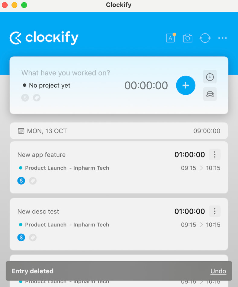
The first item’s task name is “New app feature” and project name is “Product Launch - Inpharm Tech.” Notice how the task name is above the project name and has bigger font. The task name is the prominent information in the list.
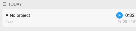
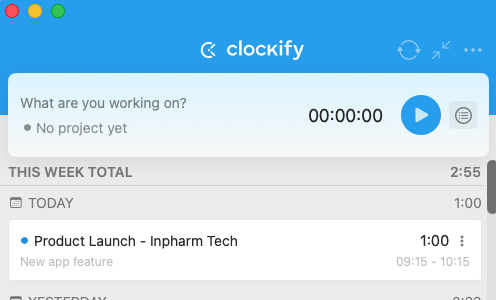
Notice how the task name “New app feature” is below the project name, is written in tiny font and is grayed out. The project name has become the prominent information.
There must have been a conscious decision to swap the importance of task name and project name in this list. I would much prefer reverting to the old version, or an option to return to the old version style where the task name is more visible and the project name is secondary.