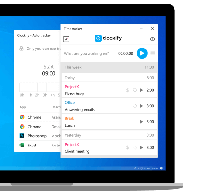
The new design is more modern, but I agree with others that it’s less user-friendly. The Play button directly on the screen was the feature I used most often, and now the Project/Task labels are very small, while the description which, according to several other comments, isn’t used much, is the most prominent text.
I also realized that the custom color for projects almost disapeared. I’m used to color-coding projects in this and other tools, and those colors used to be very visible, which helped in quickly finding the project I wanted to time. In the new version, they’re reduced to a tiny 5px dot.
Restoring more visible color cues could also improve usability, especially for users who need to track time across multiple projects throughout the day.
