In the web app, I find the layout of the timer and detailed reports page difficult to see & use because the details (description, project & task, client) end up all truncated.
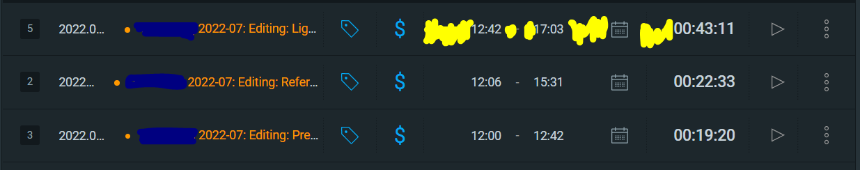
(Yellow highlights are the spaces that I wish could be smaller so I can see more of the text on the left.)
It would be great if we could:
- choose to default/switch to the view for smaller screens (where the project, task, client, tags, etc. go on separate lines) even when the screen is wider
- resize the columns
- choose which columns we want to see
- save those choices as customized views or as default preferences
Clockify might want to also revisit how it’s making use of white space, both between words and between lines. White space is great but when it’s too much, it’s hard to see which bits belong together, making it harder for users to understand and navigate the space.
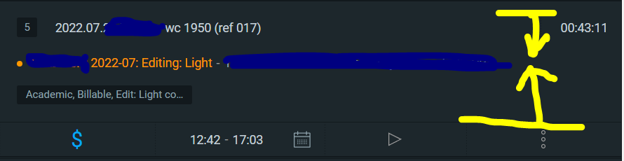
(So it’s easier to see all the details here ![]() but the vertical space could be tighter to make it clearer that they all belong to the same item.
but the vertical space could be tighter to make it clearer that they all belong to the same item.
Thanks for your consideration ![]()