Hi! We switched 2 weeks ago to Clockify premium for our timetracking activities
Our old system was built in 2002, so it is a welcomed change. Everyone in the team love it
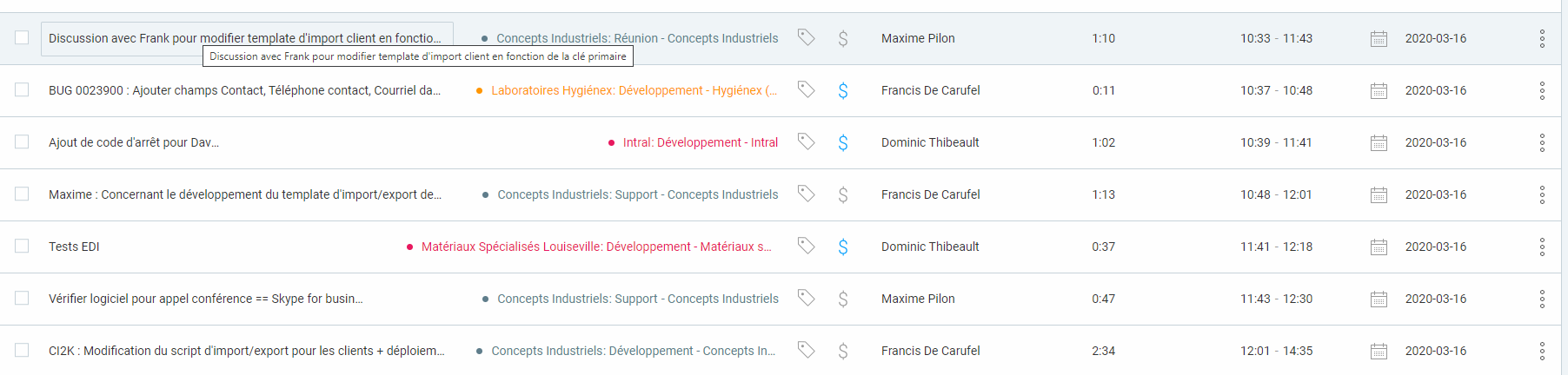
The only things that I can’t get used to is the way the description is shown in the detailled report. I’m in charge of validating the time entry and I require my staff to enter a description when they are filling their time sheet. I need to read this description to ensure that the billability flag is correct, and it’s not easy because I have to mouse over it for each line.
There is lot of lost space, between the hours and the start-stop time and between the last column. This space would be better used if the description field width was greater, of better, if we could have an option to put the description on a second line that would take all the page width