I really like the reports you have set up. One feature I’d like to request is that you add the ability to control the colors of the various tags as they show up in the charts. Having a consistent color associated with each tag would help improve the continuity across different reports and time periods.
This seems small but from a professional appearance standpoint it can go a long way. I’d like to be able to deliver these reports as-is to some of my clients but the fact that the chart is wildly different colors every time makes me not. I can export and use another spreadsheet app to re-create these charts but this is a bit of a time time sink when it needs to happen across multiple clients. The base report you have created is 95% of what is needed.
That’s an intriguing idea, I can see how this would help keep reports more neat. At the moment, there are no plans to add an option to color-code tags or to control how they show up in the chart on the report. But we appreciate your suggestion and we’ll keep it in mind for future development.
Thanks again for the feedback and feel free to let us know if you have any other suggestions!
I would also like this feature, and to add to it, I would like to be able to choose colors for different activities that I’m tracking, so that I can see at a glance, what activity I’m currently tracking. I usually keep a Clockify window open in the background, and if the whole background of the window would change color, I could easily see that. Another option would be to change the color of the Chrome extension icon based on what activity is being tracked, if that’s possible.
I just wanted to say that the feature of being able to control/set colours on reports would be very useful for us too. With our team being able to easily see time represented through colour would be invaluable.
This could definitely be a good feature that many users would appreciate. I will submit a feature request for this to the Team on your behalf for possible implementation with future updates.
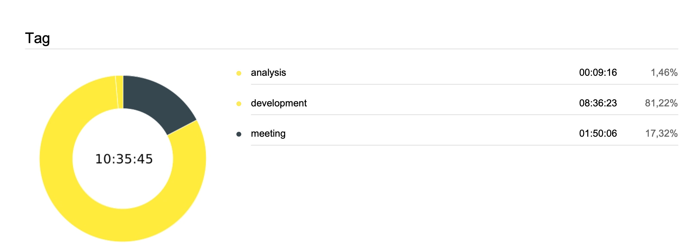
Hi, I will also like the ability to set the colors on charts, because there are some months that the colors are incredibly similars, and makes almost impossible to differentiate as shown in the image below:
I also would like this feature. Projects can be color coded by the user, but since tags are somehow automatically color coded for pie charts in reports, sometimes the same color is used. I only have 7 tags that I use for all my logs, and 3 of them have the exact same dark gray, which defeats the purpose of using the pie charts.
pl add my vote as well. I take report for monthly time tracking and every month report is created with different colour scheme. Sometime its not appealing at all.